Snagajob, Employer Product Audit
In 2019, Snagajob, the country’s largest online platform for hourly work, launched a new hiring management tool for employers. The Hub allows employers to create and manage job postings, get matched with qualified candidates, schedule interviews and interview. In the fall of 2020, I began a complete product design audit on all employer products, completed a competitive analysis and developed best-practice recommendations for product improvements, including a responsive & mobile navigational system, progressive filtering & filter chips.
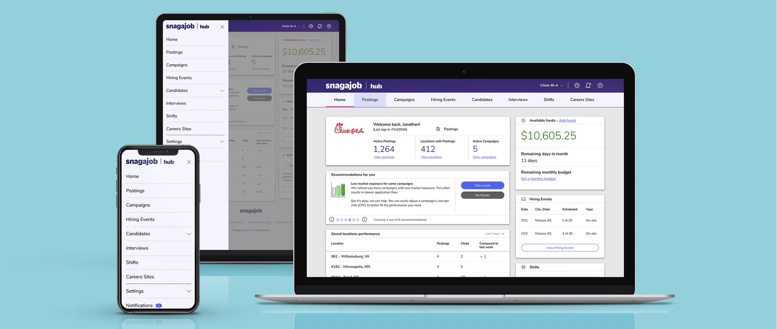
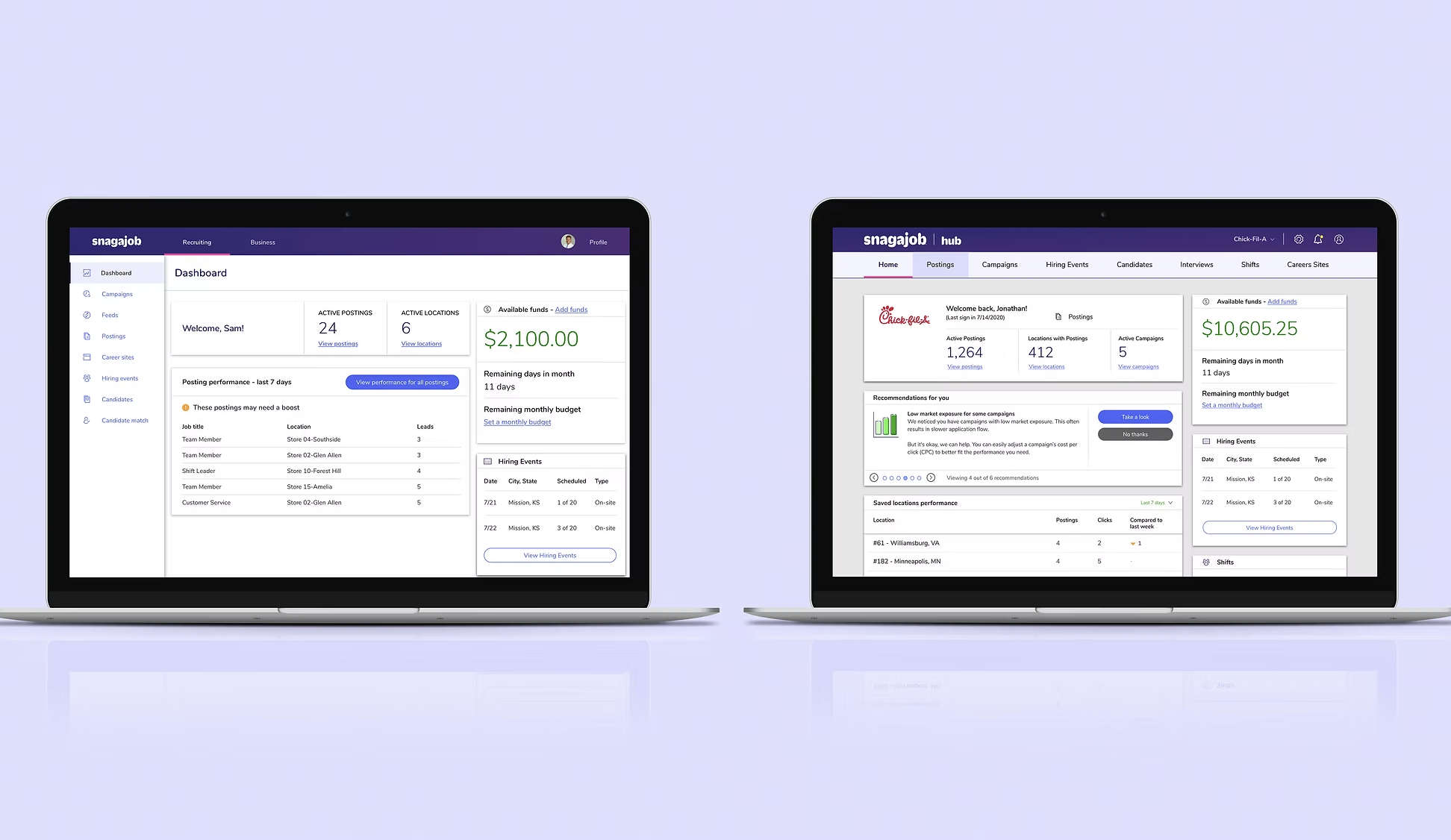
One major issue regarding the Hub was that it was not compatible for mobile devices. The page content within the Hub was not visible on a mobile device, as it was not originally built to be responsive. The navigational hierarchy did not drive users to key features and instead, pushed users to items that were settings. Therefore, missing opportunities to drive product monetization.
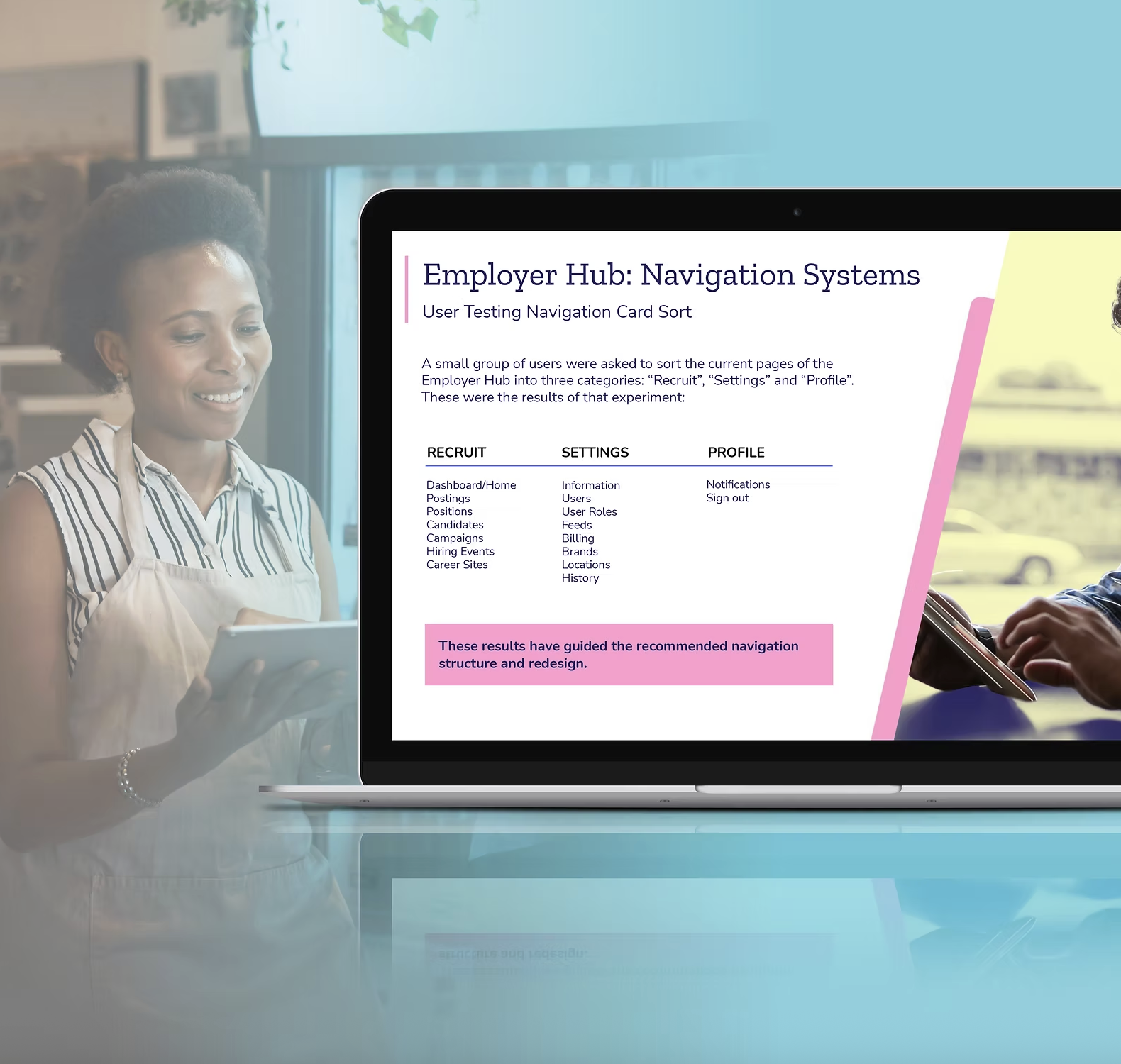
User testing proved that employers felt confused by the old tabbed navigation design and the original labeling was unclear. Card sorting exercises with users helped to define a new navigational structure, one that provided a clear path for recruiting tools, account settings and profile information.
Filtering & Sorting
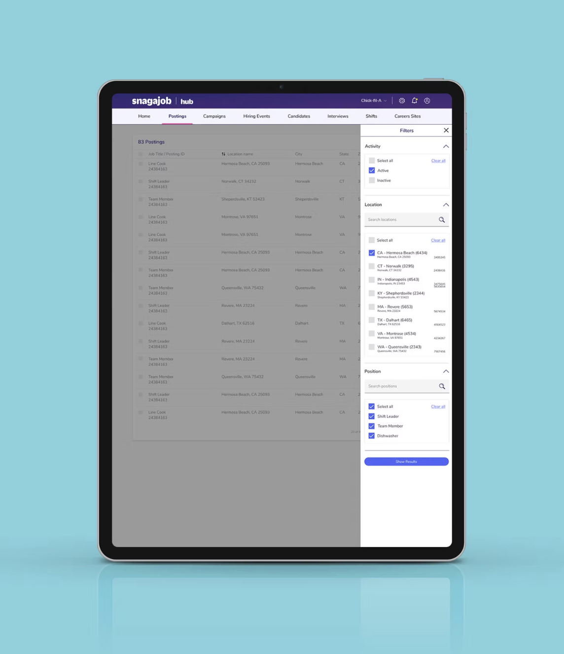
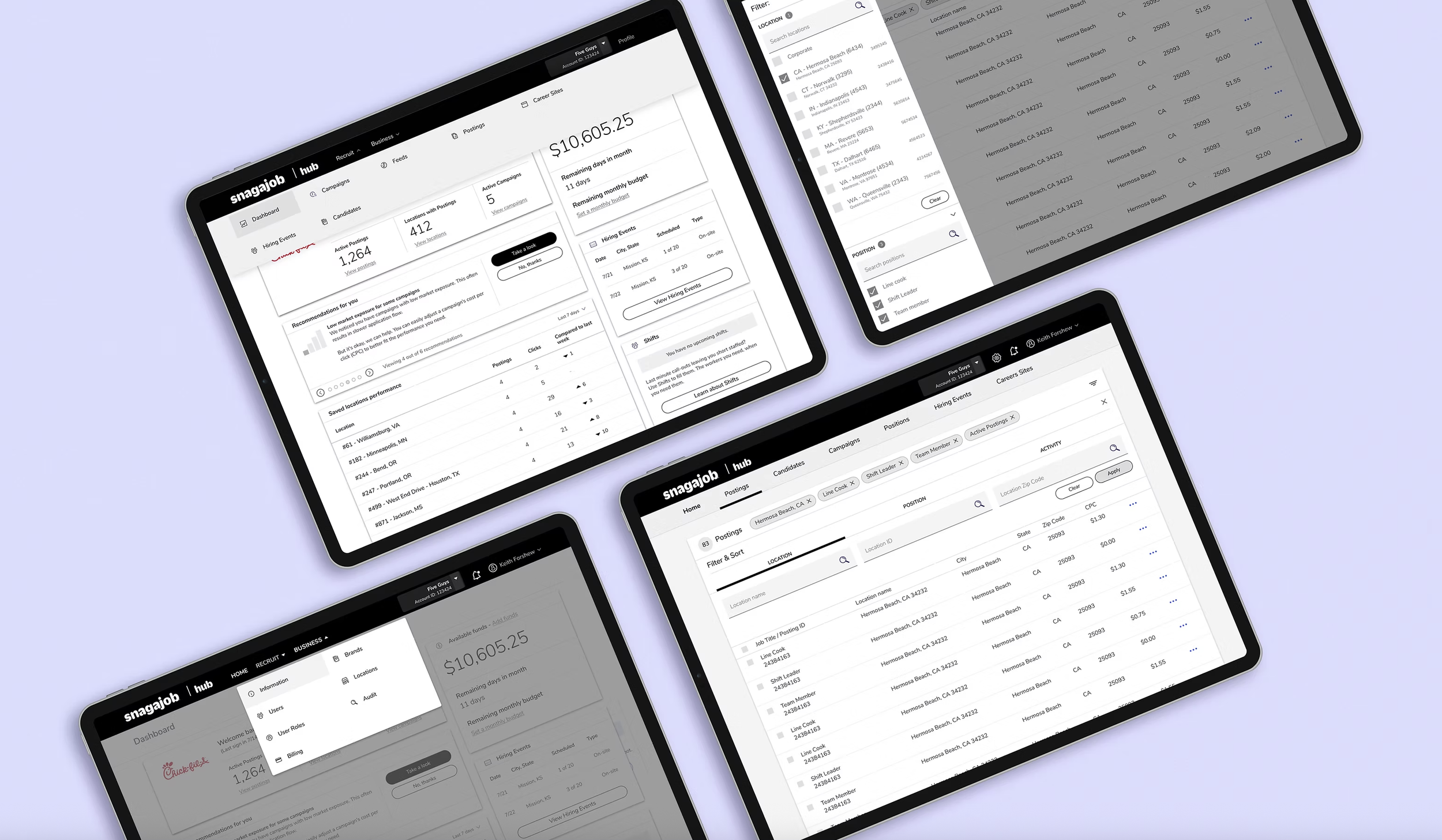
Another challenge was that the filter and sort features within the Hub were inconsistent on each page. By doing this, we created confusion with our users and they could not develop a learned pattern of behavior for filters within the platform. Some of our filters featured a simple drop down, while others were a click that triggered a slide out drawer, that then featured a drop down panel within the drawer. Too many clicks!
Intentional Design
Proper labeling was also missing from our filter buttons. Once information was filtered, the corresponding chip resembled a button in appearance. The chip is a visual element that should represent a selection that has been made on the page. Chips were then redesigned to look slightly different in shape and color from our most important element on the page: our CTAs.
The Solution
A 36 paged audit report was shared out with our executive team, along with a comprehensive presentation of user testing and proposed layouts for approval. Over the course of six months, two developers worked side-of-desk to implement the new changes across the product, which has been well received by our employer audience.
Tools & Platforms
JIRA: was our project management tool, used to track the progress of our stories
Slack: used as a daily communications tool for the development and design team
Sketch & Figma: was used to create all wireframes, draft product designs and prototypes
InVision & Figma: was essential for sharing out prototypes to key stakeholders and during user interviews
UserTesting.com: for research and moderated user testing sessions on wireframes and new prototypes