Snagajob, Product Vision
Snagajob, the country's largest and fastest-growing platform for hourly work, connects more than 47 million active job seekers with employment opportunities at 450,000 employer locations in the US and Canada. Part of that mission includes creating new products that redefine how hourly workers and employers connect, how hourly workers build their careers and how employers manage their workforce.
In 2021, the company began to reevaluate its digital presence within the hiring marketplace and began a rebranding in order to stay highly competitive. The new product vision is one that champions relationships between workers and employers and empowers both audience segments with their career and individual life goals.
A few key attributes that were focused on for the new brand was making experiences instant, relieving the stress that employers or workers feel as they go through the hiring process. We also wanted both audiences to feel confident in their hiring or employment decisions. Currently, the user experience between all of the product offerings is also very disjointed. With the new brand, the user will encounter a unified and seamless experience.
In 2018, Snagajob's products went through a rebranding that introduced a very monotone look and feel, with lots of heavy, dark colors. The new design explorations lean towards a more youthful, colorful and modern feel, with copy that is more conversational in tone.
Audience
Our research has shown that hiring managers today feel stretched thin and stressed out, especially during a world-wide pandemic. They need to staff their locations but hate the hiring process, which often includes feeling panicked to hire, worried about receiving approval for their hiring budgets, waiting to hear back from qualified applicants and high turnover.
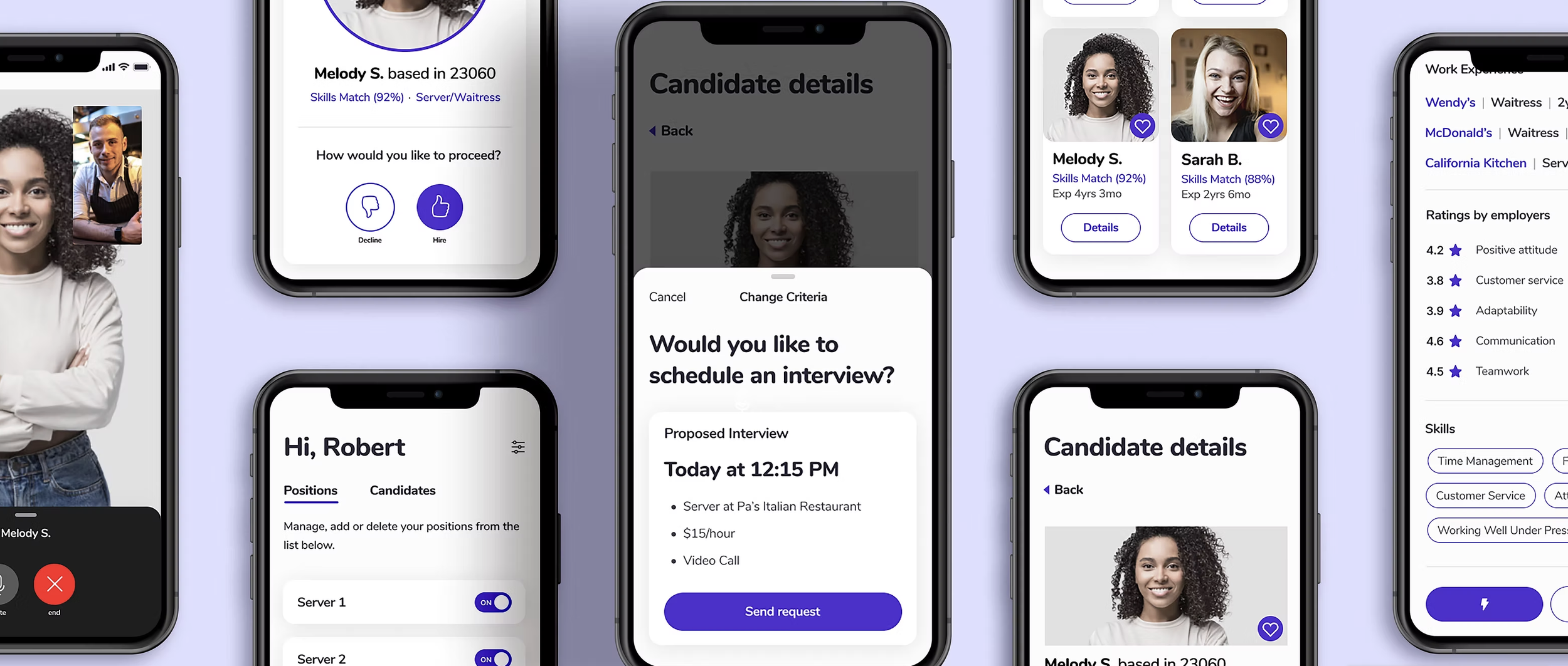
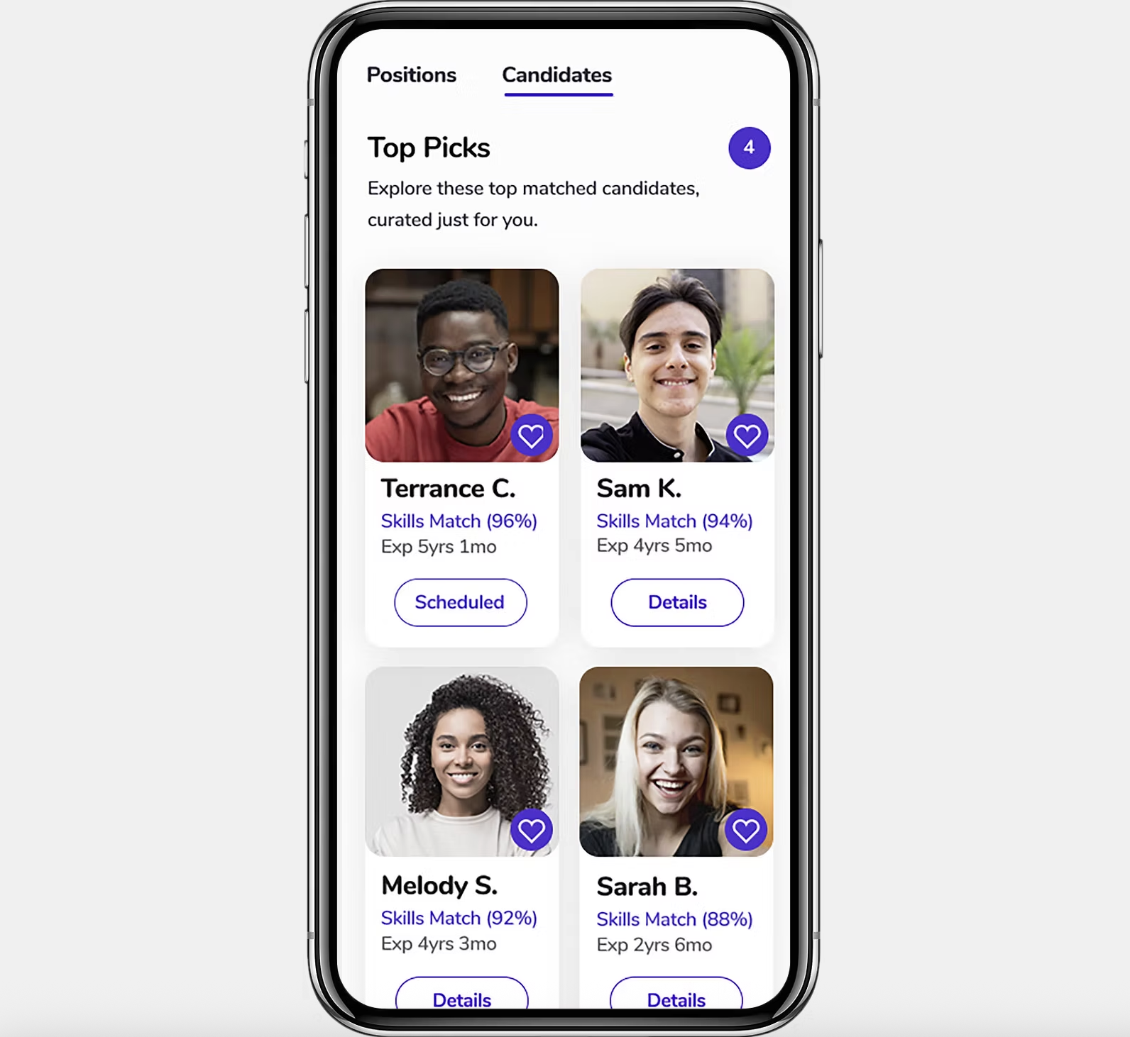
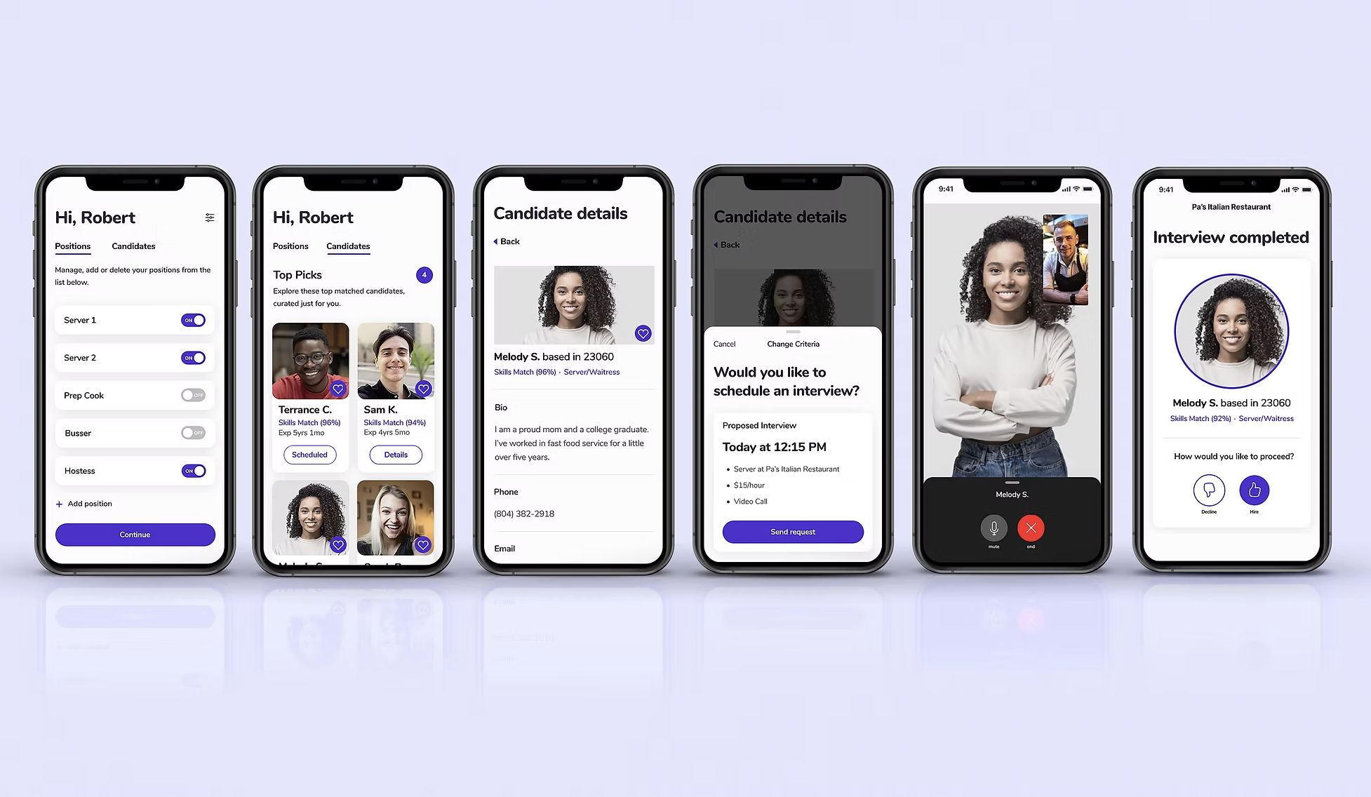
As the Product Design Manager for Snagajob’s employer products, my role in the rebrand was to collaborate with our VP of Design and our Senior Product Director and begin to create a future vision of the employer experience with Snagajob’s product offerings. We wanted to reinvent hiring for busy people - by allowing employers to toggle on positions, meet their employee match instantly and have them get to work quickly. No postings, no piles of applications, no interviews, no paperwork, just people.
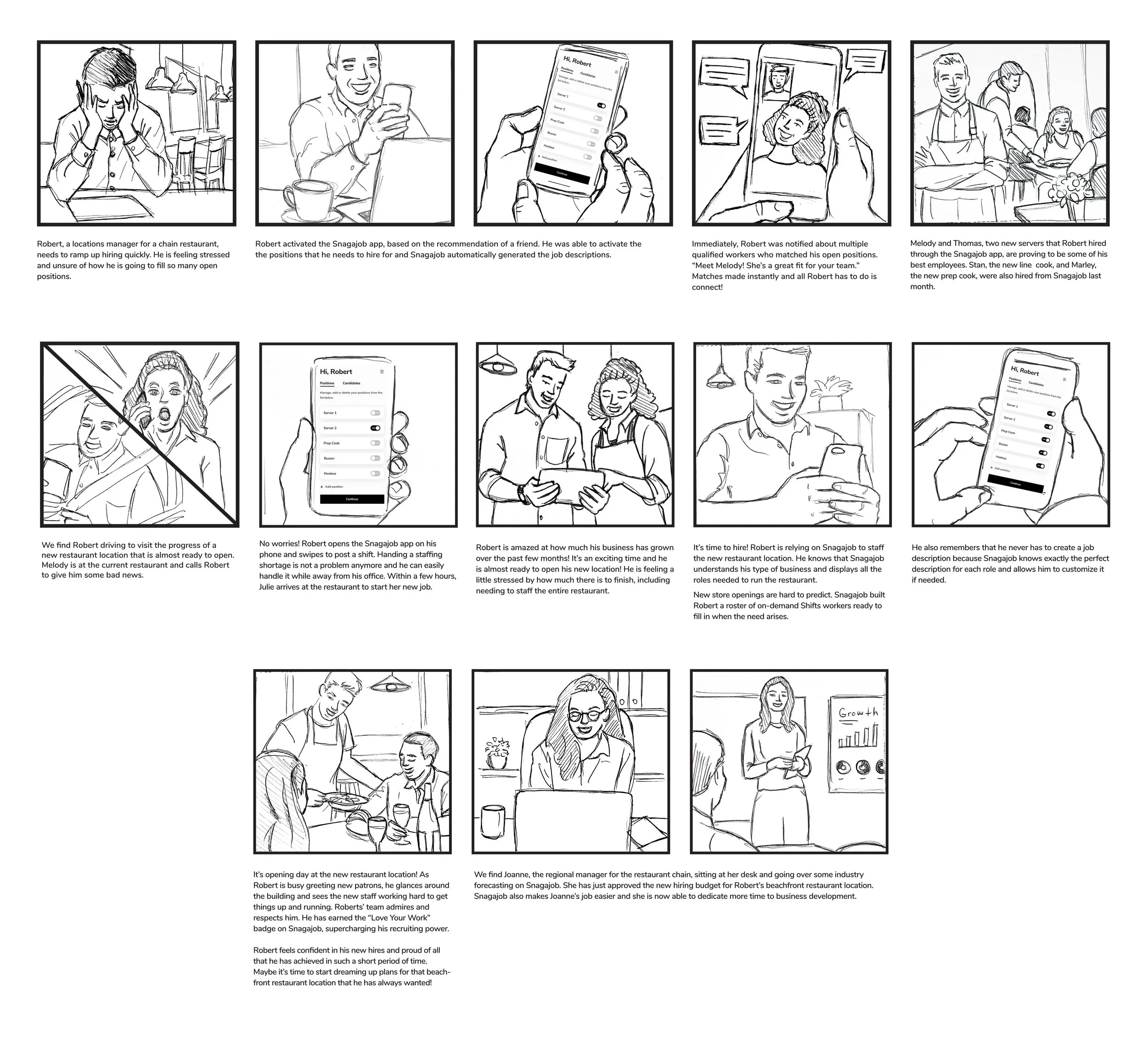
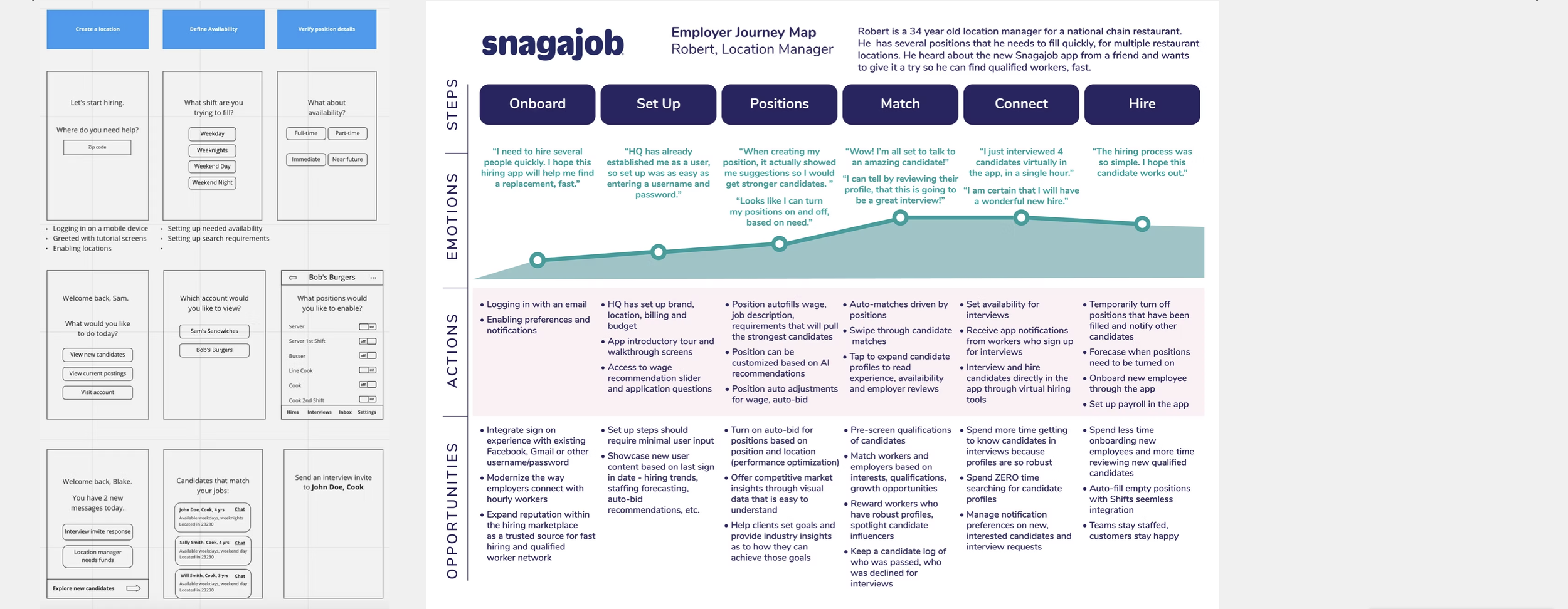
During this initial 2-3 month ideation phase, a small team of designers, including myself, focused on deliverables pertaining to key audience segments of Snagajob’s product offerings. User stories were written as if they were press releases for Snagajob’s future software features. Journey maps focused on user emotions and actions while using the future platform and highlighted product opportunities along the way. Storyboards illustrated the magic moments that the user would encounter while incorporating Snagajob in their hiring process.
Visual Language
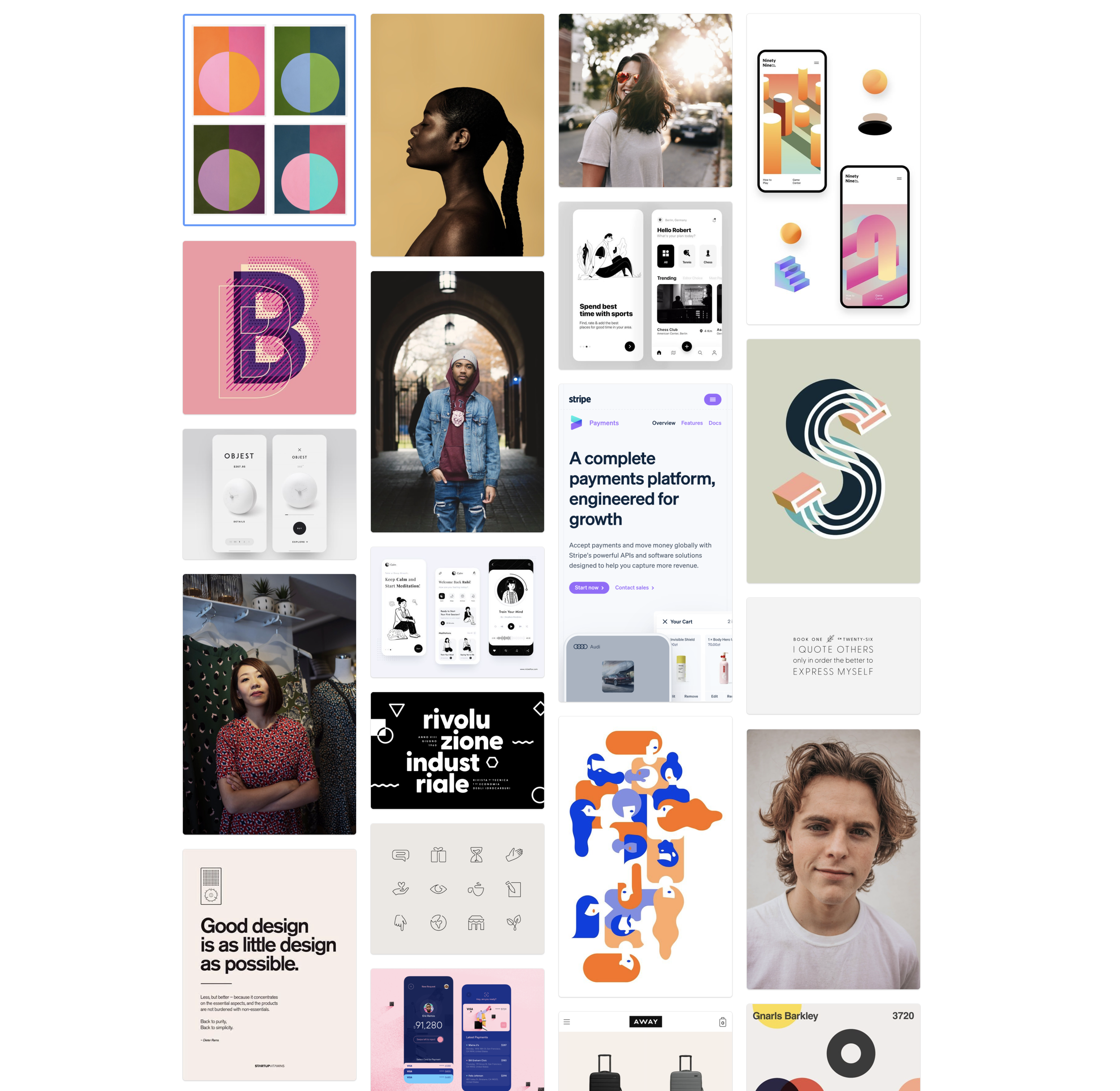
Early in the project, I compiled imagery for a visual language board—to start ideating on where we wanted the new look and feel to go. The board was made up of bold typefaces, modern color combinations, minimalist iconography, editorial style photography and simple illustrations to inspire the art direction of the project. What were we going to try to communicate with these visual elements? We knew that we wanted the product to exude a bright, bold and youthful feeling. However, we also wanted to remove all of the clutter and noise that comes with the stress of finding employment and the hiring process from the UI.
Prototypes
Initial prototypes were created to highlight key user flows for each user type. A Staff Designer at Snagajob, beautifully crafted the worker experience–from a curated home page to serving up job details on a featured employer. Typefaces explorations incorporated other options from Google Fonts that departed from Snagajob’s corporate identity typeface, Nunito. I began to look at how I could automate the user flow for when an employer would connect, interview an hire a qualified worker, in less than 6 steps. All extraneous steps and information was removed to simplify the layout and provide the best experience possible. Snagajob’s corporate purple color also got a modernized refresh, while all other pastel colors were removed.
Iterative Approach
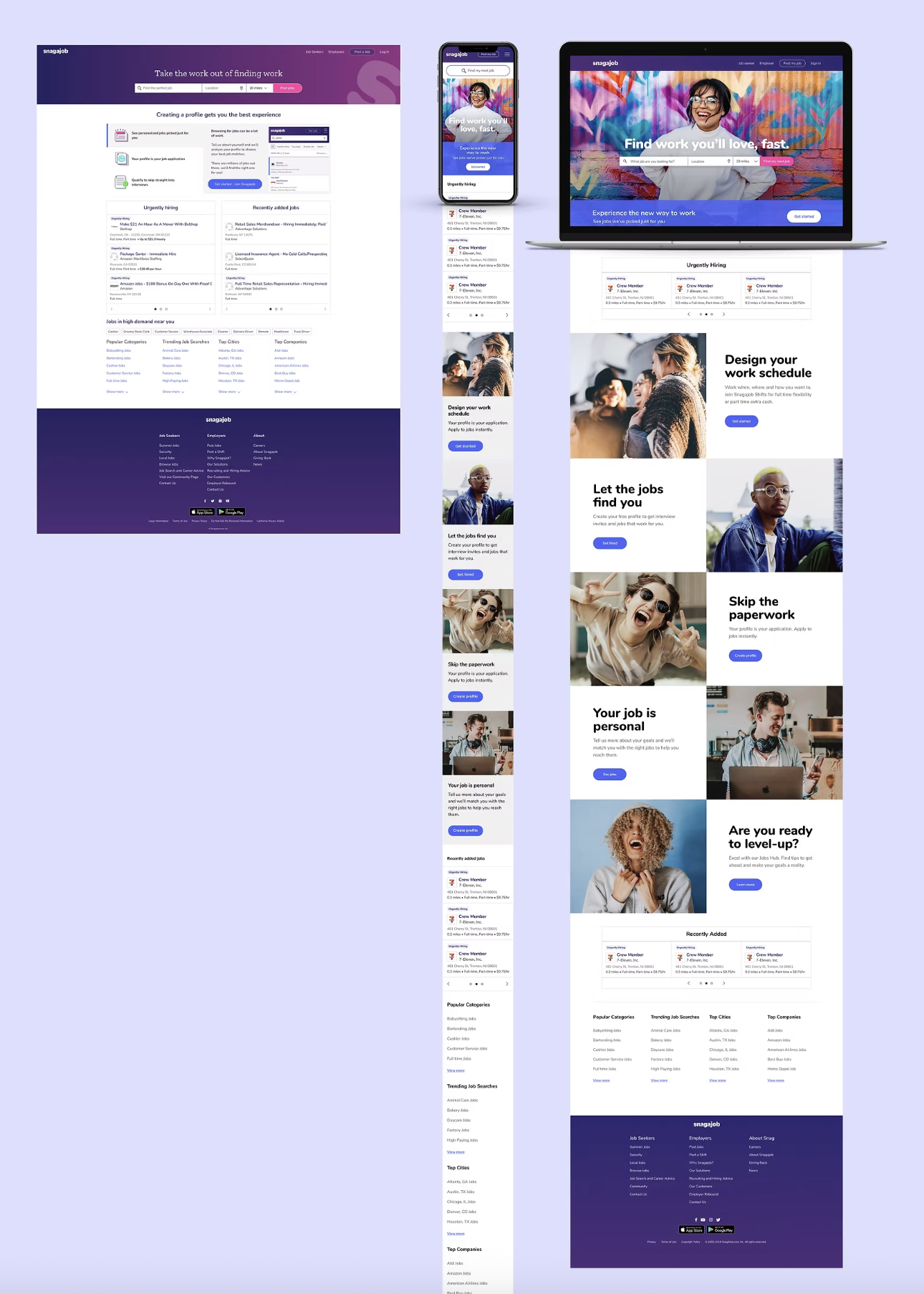
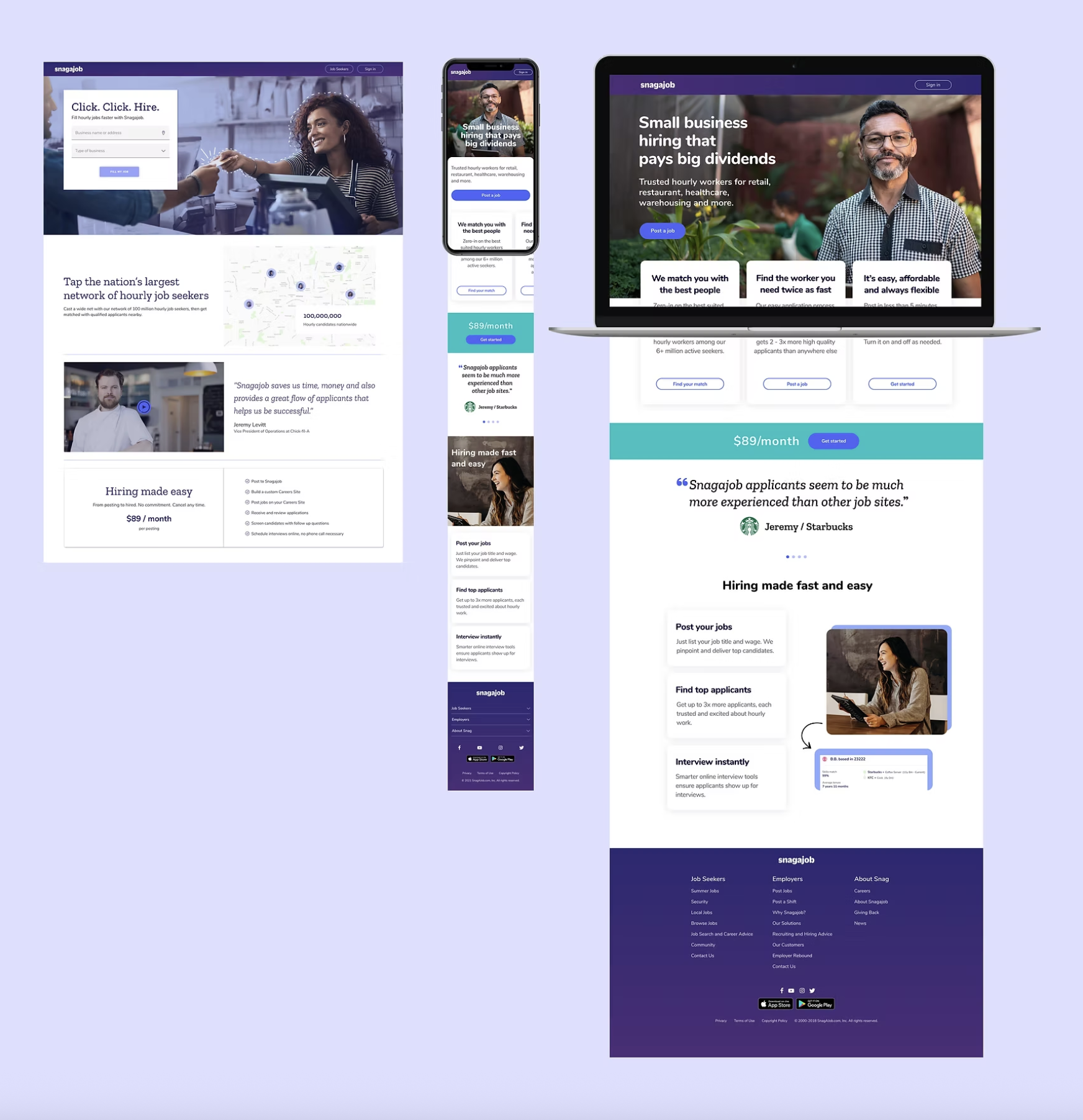
Snagajob’s home page redesign, that was launched in August of 2021, was the first step toward moving into the new brand look and tone. Focused on an iterative approach, the Nunito typeface remained, while bold and youthful photography was introduced to connect with audiences. Headline typeface sizes increased, while the amount of copy decreased overall on the page, giving more weight to Snagajob’s value propositions. This phased project will begin to introduce new brand typefaces and color palettes that will align more closely to the original prototype explorations.
Tools & Platforms
Slack: used as a daily communications tool for the development and design team
Figma: was used to create all wireframes and clickable prototypes
InVision: for building a visual language inspiration product board
Photoshop: for optimizing stock photography for web use